There are approximately 60 TV screens across campus that run the Student Playlist or direct objective content (department-specific for menus, prices, daily events, hours, etc.).
Access to appear on the Student Playlist is limited to the offices in the divisions of Student Life and Student Services and Enrollment Management. Most slides are designed by Student Life and SSEM communication teams, and the playlist is managed by these teams.
Slides may be accepted for the Student Playlist on a case-by-case basis, depending on capacity. Limit of one slide per department running at any given time. To be considered for the playlist, slides must involve high-level academic or university topics, contribute to harm reduction, or promote/support broad UO initiatives (such as the four goals of Oregon Rising). Final decisions are at the discretion of Student Life Communications.
Slides must be submitted online, not via email. Slides may run for a maximum of two weeks.
Best Practices
Think of digital displays as similar to highway billboards—maximum messaging in minimum time, quickly read. Criteria and standards for digital display design and content are as follows:
- Must follow university branding guidelines
- Must not exceed 20 words, not including a URL
- Must be JPG or PNG format file with horizontal dimensions of 1920 x 1080 pixels
- Must not contain any image or trademark we do not have the rights to use
- Must contain a URL or call to action
- QR codes must be accompanied with a spelled-out URL for accessibility
- Must be for something open to most students or a historically underserved population
- Slides that to do not qualify:
- Surveys or research unless approved by the Vice President of Student Life
- Promotion of a specific course, class, or major
- Promotion of products or merchandise
- Slides containing logos or messaging that are not supportive of institutional mission
- Product or political campaign that is not officially contracted with the university
Student programs and organizations can work with the EMU to display their ads on designated screens in the EMU. This process is run by the EMU admin team.
Design Tips
Many aspects of designing digital displays isn’t only about looking good. Everyone at the University of Oregon who creates, edits, or distributes digital content is responsible for ensuring that it is accessible to people with disabilities.
Poorly Designed Slide Example - Don’t Do This:
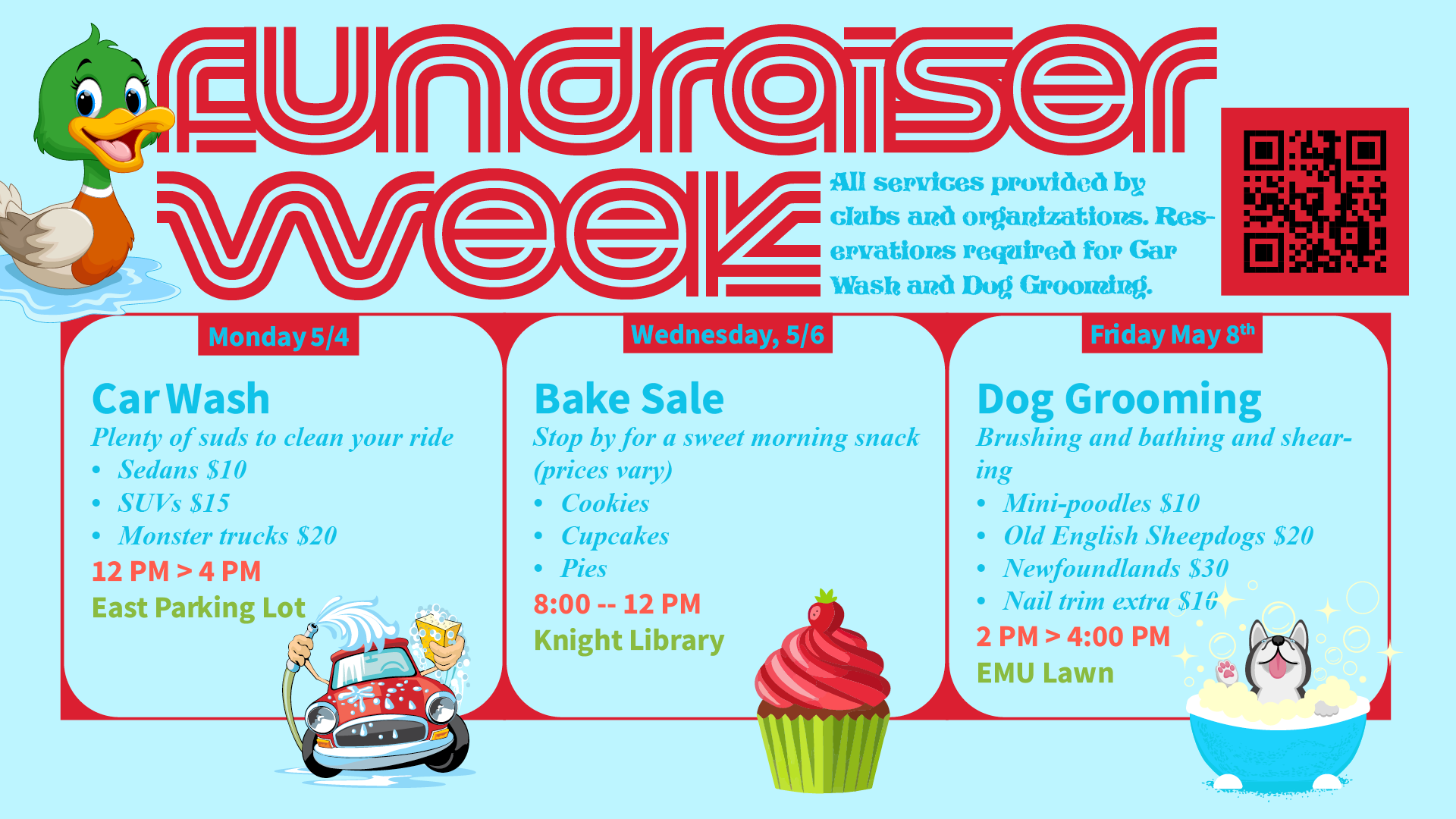
This image is an example of a poorly designed slide for digital displays (working from upper left to lower right).
- Don’t put content close to the edges. Some displays use different settings and things near the edges may get cut off.
- Don’t include arbitrary illustrations of ducks; especially ducks featuring UO colors.
- Don’t use fonts that are hard to read.
- Don’t squish text together.
- Don’t use text that has minimal contrast with the background color.
- Don’t allow words to hyphenate across lines of text. This will slow down people’s ability to understand the message.
- Don’t include a QR code without a URL. It’s important to provide a way to access the information if someone doesn’t have a smart phone.
- Don’t use a lot of different typefaces and font colors. Everything competing for attention makes it hard for the viewer to process information quickly.
- Don’t use font sizes below 40pt. Keeping font sizes larger will help people read them from across the room.
- Don’t allow images to overlap content in a way that can make it hard for people to read it. This can be especially challenging for people with vision impairments.
- Don’t fill all the space with content and images. When all (or most) of the space is filled, everything competes for attention.
Example Slide Designed for Accessibility and Readability - Do This:
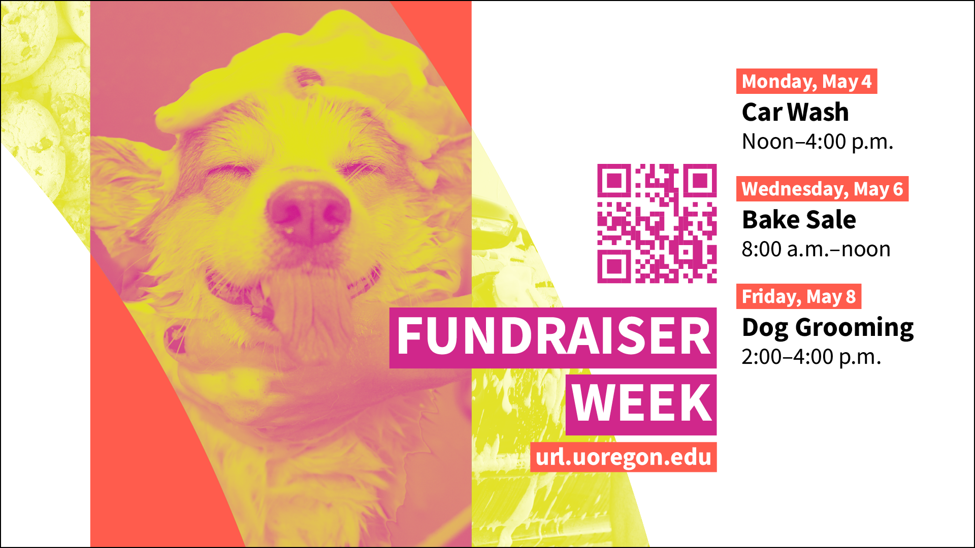
Taking the same information from the first slide, this image has been redesigned and the content has been edited to show an example of a slide that would be approved.
- Use wide margins to avoid getting cut off on screens using different display settings.
- Use typefaces that are easy to read, and the text has high contrast with background colors.
- Text follows a clear and consistent hierarchy which makes the content easy to skim quickly.
- The QR code is large enough to be scanned from greater distances and has sufficient contrast with the background.
- There is a URL included with the QR code so that all people can access more information.
- All fonts are above 40pt (the smallest is 46pt) which makes the content easier to read from greater distances.
- The design includes empty space to allow readers to better digest the information.
- The word count is limited to allow people to read everything before the display changes to the next slide.
Timeline
- Adding ready-made slides to the Student Playlist: Allow a minimum of six business days for our team to review your request.
- If you are a department within Student Life in need of design assistance, submit your request through the project request form.
- To run slides in academic buildings across campus, you will need to work directly with those departments to reserve a space.